
For this project, it was to rebrand a logo known for a known bad design to a better one.
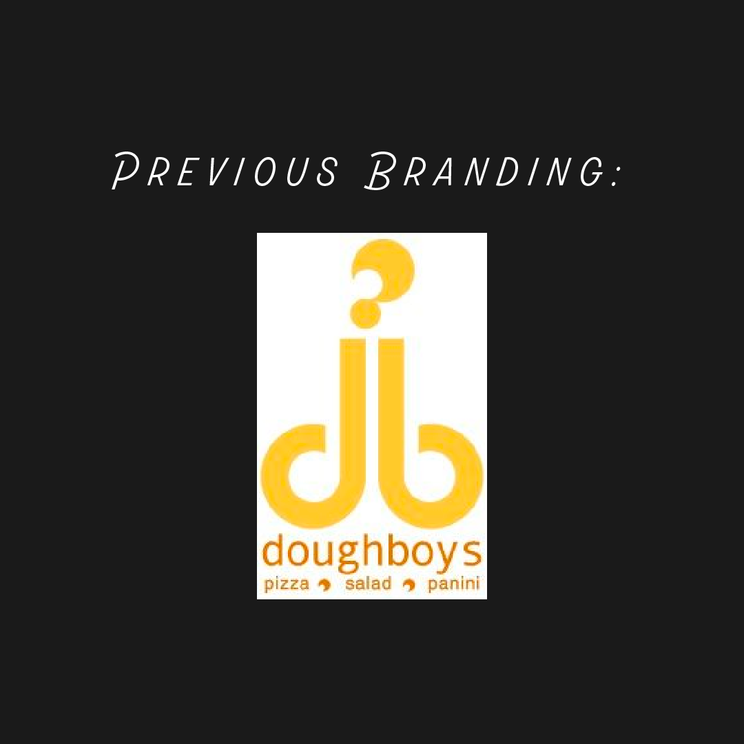
Background/Research: The restaurant for this logo, unfortunately closed in 2007 and did not have any remains of a site or social media accounts. Competition was pretty high being there was at least 12 other "Dough Boys", that also served pizza, across the United States. The disappearance of this restaurant allowed my creativity to flow for an innovative concept of a new Dough Boys Pizza.
Objective: Create a brand that has longevity and can allow Dough Boys Pizza to be indifferent from their competitors.
Target Audience: Ages 20+ or college students who show interest in music, art, fashion, and sports. Those active in social media, enjoys spending time with friends, & favor hip-hop or heavy metal music are ideal.
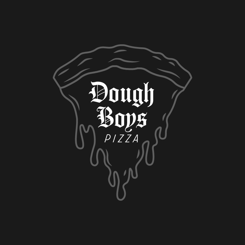
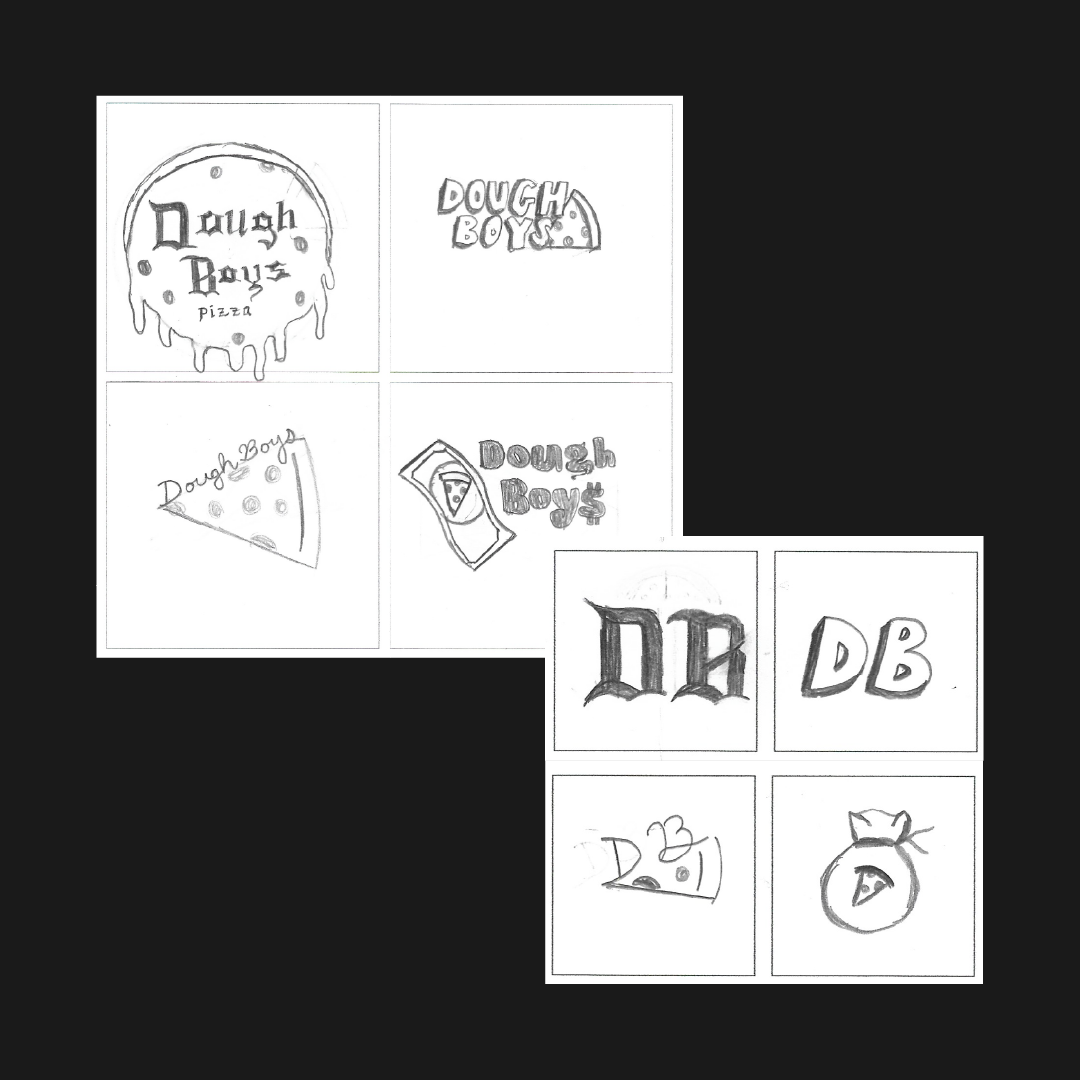
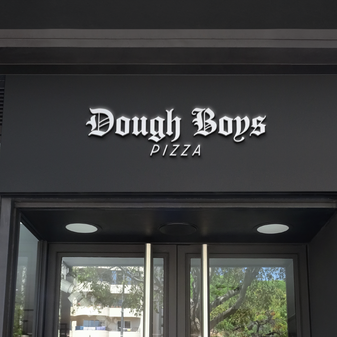
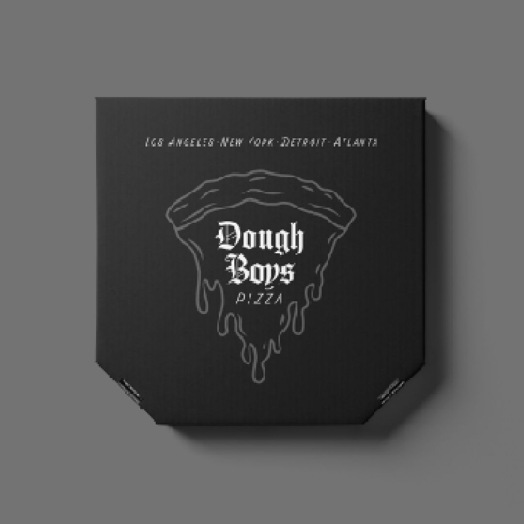
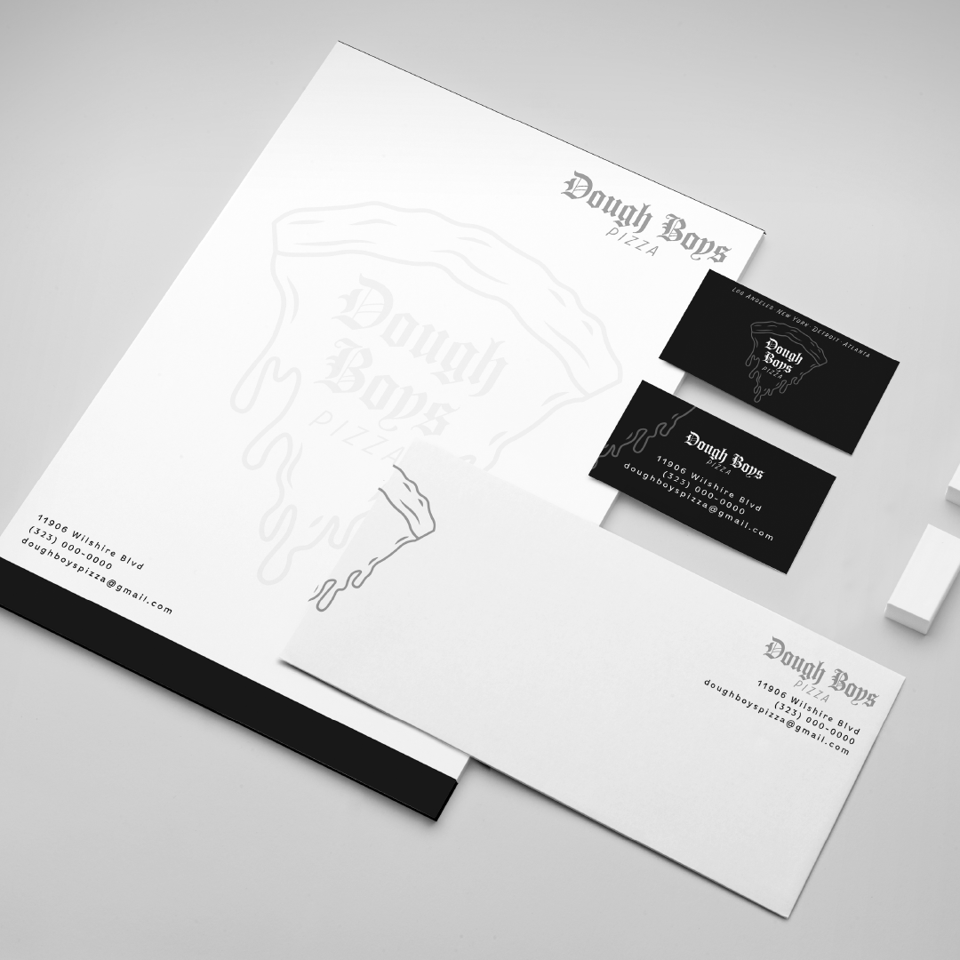
Challenges: One challenge faced was creating an illustration to match the aesthetic I had in mind for Dough Boys Pizza. The next challenge was pairing the old english font.
Solution: After receiving feedback from several colleagues on drips, line work, and line thickness, I got the illustration down and went through with the rest of the design. Originally I made the entire design old english, but I got some feedback and found this wonderful font to pair it with. Then decided to change the "pizza" portion to balance the design out.
Background/Research: The restaurant for this logo, unfortunately closed in 2007 and did not have any remains of a site or social media accounts. Competition was pretty high being there was at least 12 other "Dough Boys", that also served pizza, across the United States. The disappearance of this restaurant allowed my creativity to flow for an innovative concept of a new Dough Boys Pizza.
Objective: Create a brand that has longevity and can allow Dough Boys Pizza to be indifferent from their competitors.
Target Audience: Ages 20+ or college students who show interest in music, art, fashion, and sports. Those active in social media, enjoys spending time with friends, & favor hip-hop or heavy metal music are ideal.
Challenges: One challenge faced was creating an illustration to match the aesthetic I had in mind for Dough Boys Pizza. The next challenge was pairing the old english font.
Solution: After receiving feedback from several colleagues on drips, line work, and line thickness, I got the illustration down and went through with the rest of the design. Originally I made the entire design old english, but I got some feedback and found this wonderful font to pair it with. Then decided to change the "pizza" portion to balance the design out.